
Comparative Analysis of Tea & Coffee Websites


The Problem
Websites Compared:
Empire Coffee & Tea
Steepster
Rate Tea
The Cultured Cup
To initiate our project, we conducted a thorough scan of each selected tea and coffee website, documenting our observations. The results were systematically recorded into the table below, providing a structured overview for our competitive analysis.
After analyzing our findings, we compiled them into a table that details the main features and standout qualities of each tea and coffee website. This straightforward comparison offers a clear view of the different approaches and unique elements each site brings to the online marketplace.
Goals
Competitive Analyis
Proto Persona
User Journey
Information Architecture
LoFi Wireframes


Research Goals
Empire Coffee & Tea:
The website does not offer any filters for search results, limiting users' ability to narrow down their product options. There is no option for sorting search results, which may make it challenging to find specific products quickly.
Steepster:
The website has redundant search bars, which may cause confusion for users. There is no predictive search or auto-complete feature in the search bar, potentially making it less efficient for users.
Rate Tea:
The search bar requires search entries to be at least 4 characters long, which may be inconvenient for users with shorter queries. There is no sorting option available for search results, limiting users' ability to customize their search experience.
The Cultured Cup:
The website's contact form linked in the footer gives an error message, making it difficult for users to reach out with comments or queries. The placement of the top navigation in the middle of the page may be confusing for users accustomed to top or side navigation.
Usability Testing
Findings
Cras sit amet velit id nulla tempus dictum sit amet eu nisi.
Vestibulum ante ipsum primis in faucibus orci luctus et ultrices posuere cubilia curae. Maecenas euismod sapien eu arcu convallis, vitae vestibulum ipsum maximus.
Cras sit amet velit id nulla tempus dictum sit amet eu nisi.
Integer rutrum ante et nunc venenatis, id ultricies risus ultricies. Maecenas euismod sapien eu arcu convallis, vitae vestibulum ipsum maximus. Vivamus vitae arcu vel velit efficitur vestibulum vel in purus.
Cras sit amet velit id nulla tempus dictum sit amet eu nisi. Vivamus vitae arcu vel velit efficitur vestibulum vel in purus. Fusce aliquet turpis at orci bibendum, non convallis justo tempor.
Maecenas euismod sapien eu arcu convallis, vitae vestibulum ipsum maximus.
Donec eu felis at libero consequat sagittis a et urna.
Maecenas euismod sapien eu arcu convallis, vitae vestibulum ipsum maximus. Sed auctor augue id tellus lacinia, nec ultricies est fermentum. Cras sit amet velit id nulla tempus dictum sit amet eu nisi.
Donec eu felis at libero consequat sagittis a et urna.
Fusce aliquet turpis at orci bibendum, non convallis justo tempor. Praesent nec orci at nulla consequat congue ut non arcu. Lorem ipsum dolor sit amet, consectetur adipiscing elit.
Integer rutrum ante et nunc venenatis, id ultricies risus ultricies. Integer rutrum ante et nunc venenatis, id ultricies risus ultricies.
Lorem ipsum dolor sit amet, consectetur adipiscing elit.
Mid-Fi Wireframes
Usability Testing II
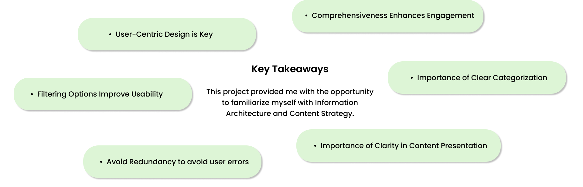
Closing Note
Comparative Analysis of Tea & Coffee Websites
Kickoff
Websites Compared:
Empire Coffee & Tea
Steepster
Rate Tea
The Cultured Cup
To initiate our project, we conducted a thorough scan of each selected tea and coffee website, documenting our observations. The results were systematically recorded into the table below, providing a structured overview for our competitive analysis.
After analyzing our findings, we compiled them into a table that details the main features and standout qualities of each tea and coffee website. This straightforward comparison offers a clear view of the different approaches and unique elements each site brings to the online marketplace.
Goals
First Down
LoFi Wireframes
Hi-Fi Wireframes
Post-Game Reflection
Comparative Analysis of Tea & Coffee Websites
The Problem
Websites Compared:
Empire Coffee & Tea
Steepster
Rate Tea
The Cultured Cup
To initiate our project, we conducted a thorough scan of each selected tea and coffee website, documenting our observations. The results were systematically recorded into the table below, providing a structured overview for our competitive analysis.
After analyzing our findings, we compiled them into a table that details the main features and standout qualities of each tea and coffee website. This straightforward comparison offers a clear view of the different approaches and unique elements each site brings to the online marketplace.
Goals
Empire Coffee & Tea
Main Features
- Top navigation with categories for coffee, tea, makers & filters, gift baskets, gourmet foods, mugs, history, and help.
- Search bar located on the left side of the homepage, above the main navigation.
- Banner image of their shop.
- Contact information listed under the help tab.
- Physical location with delivery services.
Standout Qualities
- Specializes in offering a wide variety of coffee and tea products.
- Provides a visually appealing website with a banner image showcasing their shop.
- Offers a user-friendly search bar and navigation system.
- Emphasizes customer support through contact information and help resources.
- Provides a physical location and delivery services, providing convenience for customers.
Steepster
Main Features
- Top navigation with pages for tea, places, discussions, explore, learn more, sign up, and login.
- Two search bars, one on the top right corner and one in the banner section.
- Ability to filter tea by type, category, and companies.
- Sorting options for search results.
- Discussions tab for users to engage in tea-related conversations.
Standout Qualities
- Provides a platform for tea enthusiasts to share their experiences and engage in discussions.
- Offers a comprehensive search and filtering system for finding specific types of tea.
- Emphasizes community engagement and exploration through various tabs and sections.
- Allows users to discover new tea places and connect with other tea lovers.
Rate Tea
Main Features
- Comprehensive top navigation with categories for Styles, Brands, Regions, People, Places, Images, Articles, News, Contact, and About.
- Search bar accessible from every page, although search entries must be at least 4 characters long.
- Consistent breadcrumbs throughout the website.
- Provides options for sorting search results.
- Offers articles and information about the history of the organization.
Standout Qualities
- Focuses on providing extensive information and resources about tea.
- Offers a wide range of categories for navigation, allowing users to explore different aspects of tea.
- Provides in-depth search options for users to find specific types of tea.
- Emphasizes the educational and informative aspect of tea through articles and history.
The Cultured Cup
Main Features
- Top navigation with pages for tea, coffee, sweets, events, and explore.
- Search bar located on the right side of the homepage, accessible from every page.
- Ability to narrow down search results.
- Provides sorting options for search results.
- Discussions tab for open-ended conversations.
- Physical location in Texas, with both pickup and delivery options.
Standout Qualities
- Offers a diverse range of products, including tea, coffee, and sweets.
- Focuses on creating a community through discussions and events.
- Provides a convenient search and filtering system for finding specific products.
- Offers both pickup and delivery options, giving users flexibility in how they receive their orders.
Empire Coffee & Tea:
The website does not offer any filters for search results, limiting users' ability to narrow down their product options. There is no option for sorting search results, which may make it challenging to find specific products quickly.
Steepster:
The website has redundant search bars, which may cause confusion for users. There is no predictive search or auto-complete feature in the search bar, potentially making it less efficient for users.
Rate Tea:
The search bar requires search entries to be at least 4 characters long, which may be inconvenient for users with shorter queries. There is no sorting option available for search results, limiting users' ability to customize their search experience.
The Cultured Cup:
The website's contact form linked in the footer gives an error message, making it difficult for users to reach out with comments or queries. The placement of the top navigation in the middle of the page may be confusing for users accustomed to top or side navigation.
Site Maps
Findings
Comparative Analysis of Tea & Coffee Websites
Phase I : Ideation
Websites Compared:
Empire Coffee & Tea
Steepster
Rate Tea
The Cultured Cup
To initiate our project, we conducted a thorough scan of each selected tea and coffee website, documenting our observations. The results were systematically recorded into the table below, providing a structured overview for our competitive analysis.
After analyzing our findings, we compiled them into a table that details the main features and standout qualities of each tea and coffee website. This straightforward comparison offers a clear view of the different approaches and unique elements each site brings to the online marketplace.
Phase II : Prototyping the Scooter Model
Phase III: Integrating Movement Mechanics
Phase IV: Game Environment
Empire Coffee & Tea:
The website does not offer any filters for search results, limiting users' ability to narrow down their product options. There is no option for sorting search results, which may make it challenging to find specific products quickly.
Steepster:
The website has redundant search bars, which may cause confusion for users. There is no predictive search or auto-complete feature in the search bar, potentially making it less efficient for users.
Rate Tea:
The search bar requires search entries to be at least 4 characters long, which may be inconvenient for users with shorter queries. There is no sorting option available for search results, limiting users' ability to customize their search experience.
The Cultured Cup:
The website's contact form linked in the footer gives an error message, making it difficult for users to reach out with comments or queries. The placement of the top navigation in the middle of the page may be confusing for users accustomed to top or side navigation.
Phase V: Collisions for Dynamic Interactions
Closing Note